Service Partner Portal
Polestar
Project Overview.
Service Partner Portal is a platform designed for Polestar's service partners to manage tire deliveries, schedule services, and handle additional accessories like lowering kits. The primary goal was to enhance communication between Polestar and their service partners, such as tire hotels and accessory installers, while increasing efficiency in managing third-party service engagements. This platform aimed to provide a seamless experience for Polestar owners when scheduling services like tire changes or accessory installations. Our approach was heavily influenced by a need to integrate closely with existing systems that service partners were already comfortable using, reducing friction and complexity in the learning process.

Role
As the UX Designer, I led the design efforts for this project, collaborating with a cross-functional team that included developers, product owners (PO), product area managers (PAM), and other stakeholders. Our mission was to build minimum viable products (MVPs) that we could iterate upon based on user testing and feedback from real-world settings. The focus was on creating a portal that would seamlessly integrate into the workflows of partner service points, ensuring usability and minimizing the learning curve.

Methods & Tools
User Research
Shadowed technicians and interviewed staff at various service points to understand the current workflows, processes, and pain points they experienced.
Usability Testing
Conducted tests with service partners at multiple locations, utilizing their direct feedback to shape further iterations.
Figma
Developed detailed wireframes and interactive prototypes for testing and iteration.


Discovery
The first phase of the project was on-site research. We visited several service points, including tire hotels and partner workshops, to observe technicians in their daily work environment. This ethnographic approach allowed us to gain first-hand insight into the existing tools and workflows used by the partners. Since many service partners already used systems they were familiar with, we aimed to design a portal that complemented these systems, creating a familiar interface that minimized the onboarding effort.
Use Cases
Our research informed the development of several critical use cases for the portal:
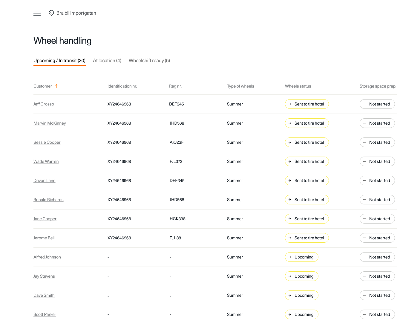
- Tire Delivery Tracking: This service tracks tire migrations from Polestar to the partner service points and eventually to the customer, ensuring visibility at each process stage.
Service Scheduling
- Creating an intuitive scheduling flow for tire changes or accessory installations, allowing both service partners and Polestar owners to manage their appointments seamlessly.
Accessory Management
- Manage the installation of accessories like lowering kits and offer service partners a centralized hub for related tasks.
Design Requirements
Tire Migration Tracking
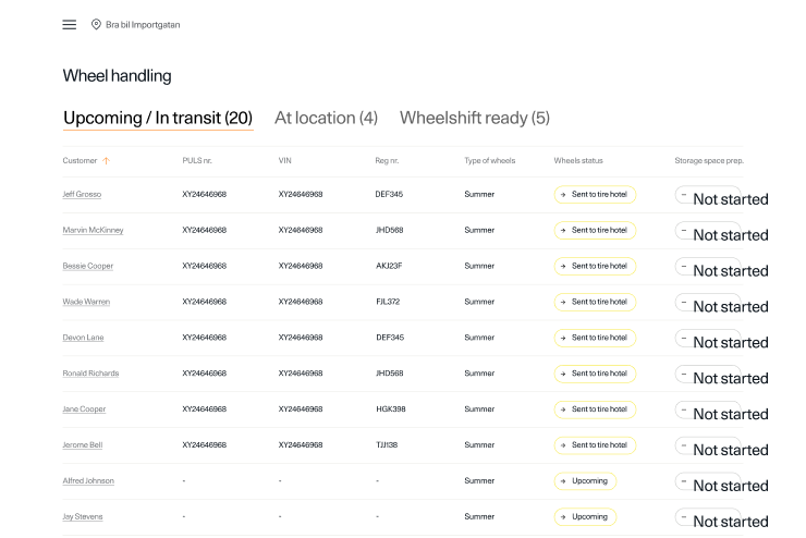
Provide transparency of tire delivery and storage processes.
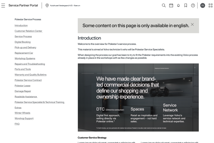
Access to Guidelines and Manuals
Include easily accessible reference material for various services, allowing partners to quickly find the information they need.
Integration with Existing Systems
The portal should feel familiar, with interaction patterns that align with the systems that partners were already using.

Ideation
During ideation, we worked on finding the optimal way to balance information density with usability. The portal had to present a lot of critical data, but it was also important that the information be accessible and actionable for service partners without feeling overwhelmed.
We explored different layouts, navigation options, and interaction patterns to determine how best to structure workflows, such as tire tracking and scheduling. Wireframes and prototypes were built in Figma, and iterated on in close collaboration with both developers and stakeholders to ensure technical feasibility and alignment with business goals.
Sketches and Wireframes
We started with rough sketches to visualize user flows and key features, ensuring a structured layout for tire tracking, service scheduling, and manuals.
After internal validation, we created low-fidelity wireframes in Figma, mapping out:
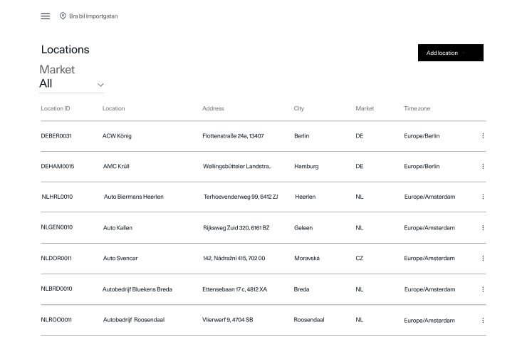
- Dashboard – Tire status, appointments, notifications.
- Scheduling – Easy booking for service partners.
- Manuals – Organized access to digital guides.
Stakeholder feedback helped refine the layout, ensuring alignment with business and user needs.

Prototype.
After finalizing the wireframes, we created an interactive prototype in Figma. This mid-fidelity prototype allowed us to simulate the user experience, focusing on key interactions such as:
- Tire Tracking Flow: Users could navigate through the process of tracking a tire's delivery status, from shipment to final installation.
- Service Scheduling: The prototype featured a step-by-step flow for scheduling appointments, making it easy for service partners to select available time slots and confirm bookings.
- Manual Lookup: A fully interactive version of the manual lookup feature was included, allowing technicians to search and navigate through different categories of service documentation.
The prototype was then tested internally, with stakeholders and a small group of service partners, to validate that the flow and structure were intuitive.

Collaboration & Iteration
Regular design reviews with stakeholders, developers, and product owners ensured alignment with project goals. Feedback led to key improvements:
- Navigation – Added a persistent side menu for easier access to frequently used features.
- Dashboard – Enhanced visual hierarchy to highlight delivery statuses and upcoming services.
- Manual Lookup – Improved search functionality for quicker access to service procedures.
This iterative process refined the design for better usability and efficiency.
User flow.
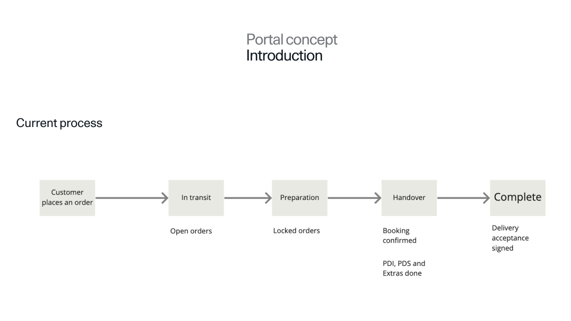
Our design focused on optimizing the service process between Polestar, service partners, and customers. Understanding the existing workflow helped shape key improvements in the portal.
Process Flow:
- Order Placement – Customers place an order, initiating the service process.
- In Transit – Open orders are managed as service partners prepare for incoming work.
- Preparation – Partners confirm and lock orders for a scheduled time.
- Handover – Bookings are finalized, including pre-delivery inspection (PDI) and additional extras.
- Completion – Service tasks are finished, with final handovers and delivery acceptance.
By analyzing each stage, we identified inefficiencies and streamlined interactions, automating repetitive tasks within the Service Partner Portal.
Collect Feedback
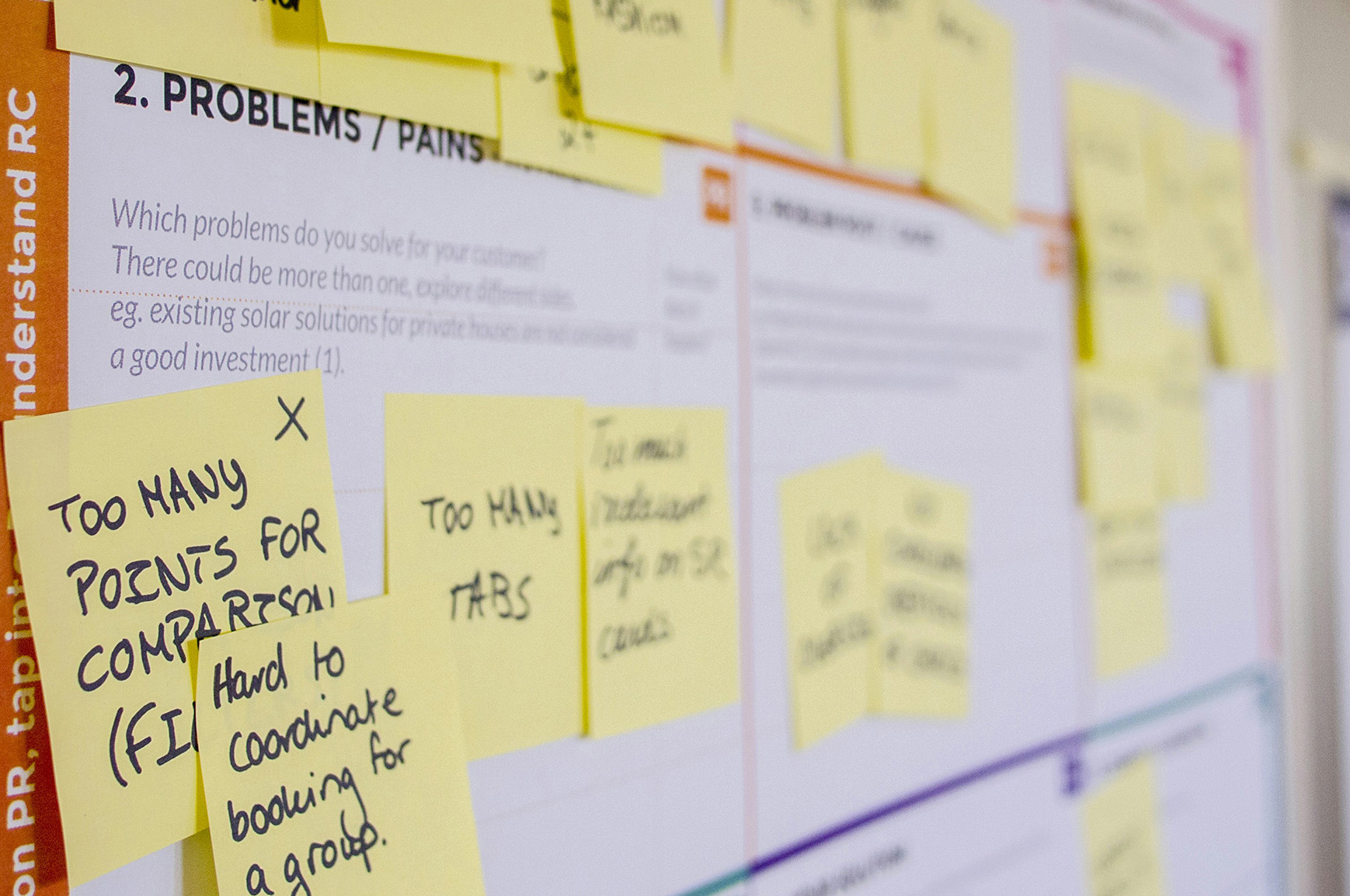
Throughout the testing process, we gathered qualitative feedback from the participants. We noted where users struggled, such as confusing navigation paths, unclear icons, or difficulties in finding specific information. In particular, service partners highlighted challenges related to accessing certain features within the tire tracking flow and the complexity of managing multiple service appointments simultaneously.
Users also provided positive feedback, particularly on features that simplified their workflow, such as the integrated dashboard overview and the ability to update service statuses in real time.
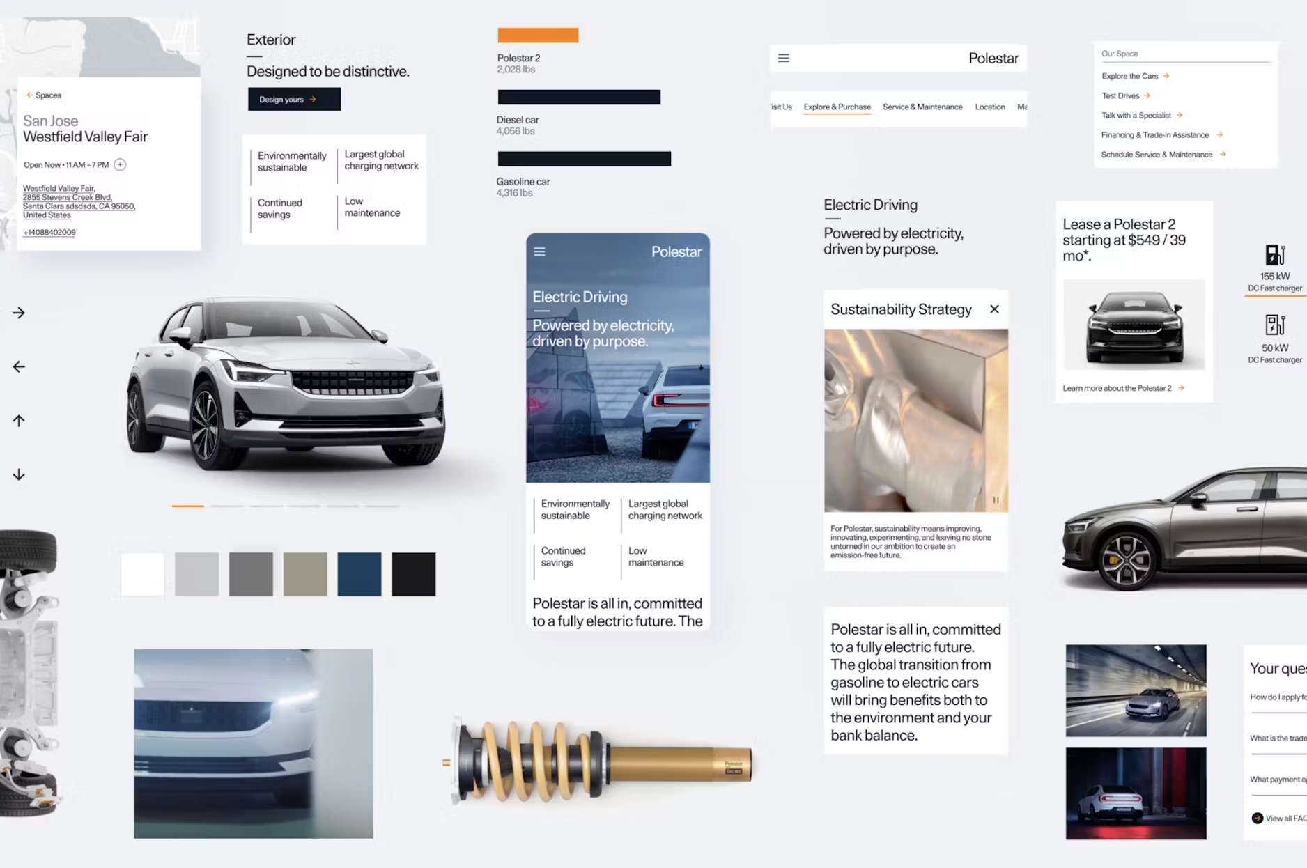
Analyze and Iterate
Usability testing highlighted key issues, prompting refinements to improve navigation, clarity, and accessibility.
Key Insights & Solutions:
- Complex Navigation Paths – Users found navigation confusing, so we simplified menus and added shortcuts for quicker access.
- Cluttered Dashboard – Adjusted visual hierarchy by refining font sizes, colors, and grouping to make key details stand out.
- Difficult Manual Lookup – Enhanced search functionality with filters and predictive search, improving document accessibility.
These iterations streamlined interactions, ensuring a more intuitive and efficient experience.
Refine the Design.
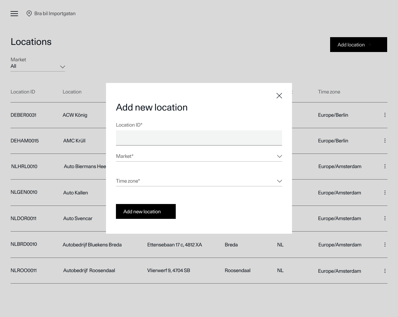
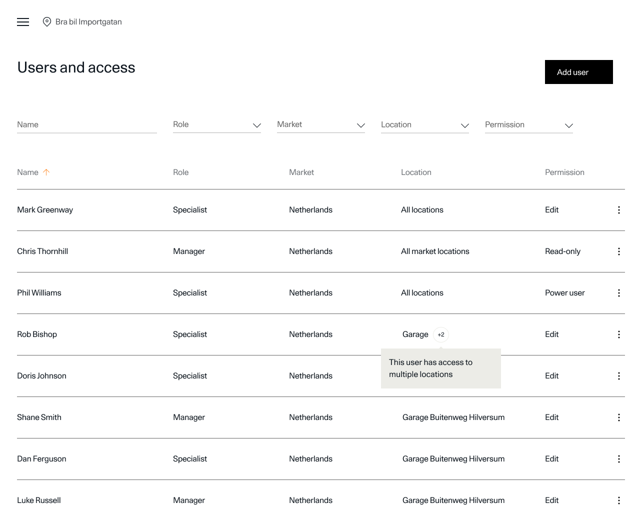
Based on the final testing and iteration cycles, we polished the design to ensure a high level of usability and alignment with partner expectations. We created high-fidelity mockups in Figma that showcased the portal across different screens and states, including mobile and desktop views. This ensured the solution was optimized for consistent user experience across various devices, providing seamless access to all features and services.
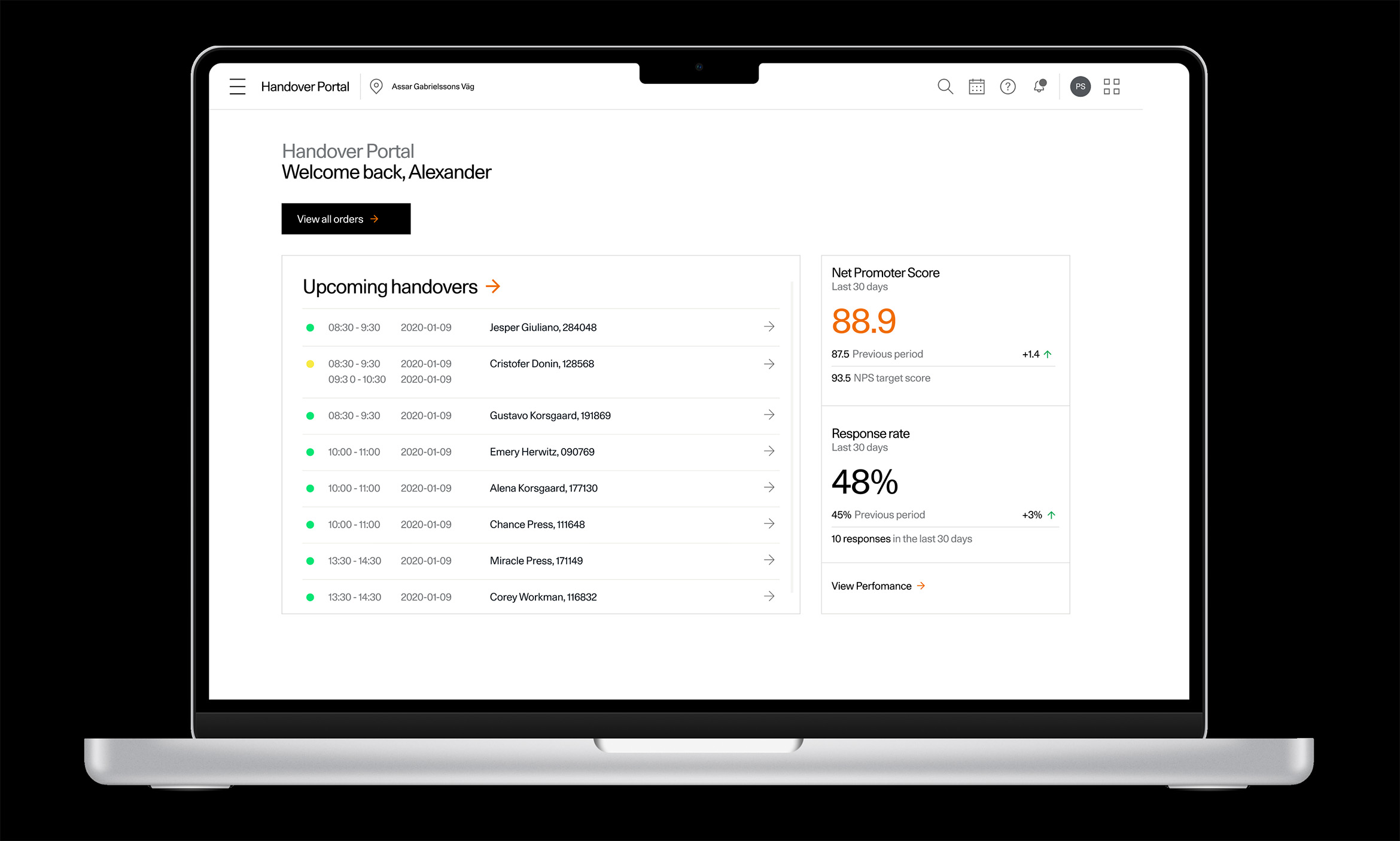
Due to confidentiality, some research, discussions, and design details can't be shared. This case study covers the process, challenges, and solutions.